
Sunday, April 10, 2011

Saturday, March 26, 2011
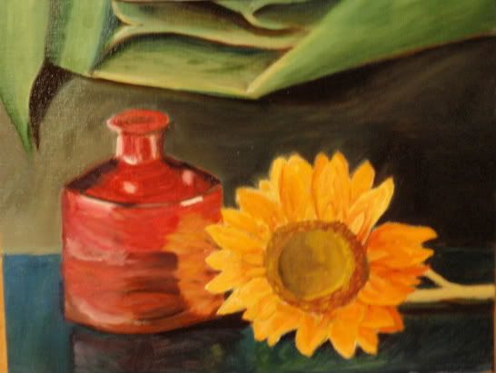
Planned Still Life
I recently finished the Ted Goerschener Workshop Book. This painting is not a exercise from the book, but a replection of what I tried to do. First of all, I drew this out in much more detail than I have ever used. I took measurements of the pieces and then sketched the local, highlight and shadow lines. I started with a complete transparent red oxide underpainting. That was cool as I have never attempeted it. So far this is a series of transparent colors built up. The glass vase has been the most difficult. It must appear round and transparent at the same time. The sun flower will need 2 more coats at least to start to take shape. Even though I am using cadmiums, there is not enough covering power for the underpaint and pencil marks. Anyway, this is my weekend.

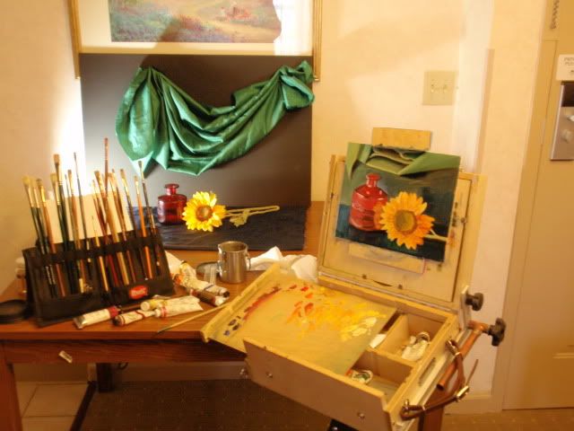
Here is my set up in the hotel room. Keeps the boredom in check..

Here is my set up in the hotel room. Keeps the boredom in check..
Sunday, February 6, 2011
Pear Studies
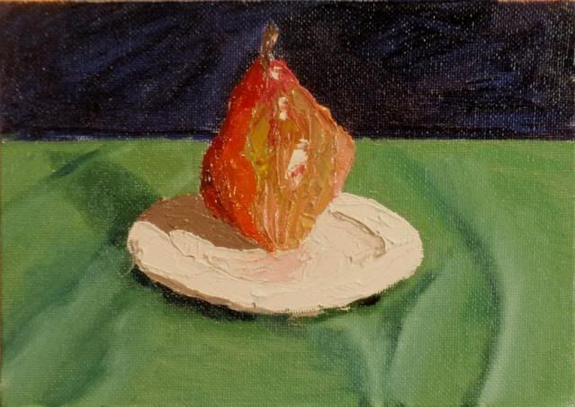
Bought some new fruit at the Wegmans. A bartlett and a red pear. Decided to work on drawing the foreshortened plate in these. Man do I need a lot of work on that. Also felt like doing some pallet knife work on the textured canvas. Man do I hate textured canvas. Well, at least the rough junk. I need to load them with gesso to fill in the texture. And as usual, cheap camera does not get the colors right, but I am trying to do a little editing
Barlett. 5x7 gesso panel
This pear had a nice peachy splotch.


Barlett. 5x7 gesso panel
This pear had a nice peachy splotch.
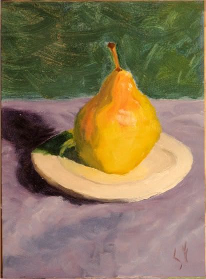
Red Pear 5x7 canvas
This pear had so many colors running through it. I enjoyed trying to render.
Wednesday, February 2, 2011
More Color Studies with Fruit
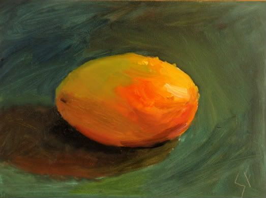
Having some fun with fruit and on to more color studies. Yes I really love Mangos, but when I visited the store, I bought these two mangos so I could Paint them. Trying to apply some of the lessons from the block studies. By the Way. A cheap camera cannot pick up the colors correctly so in person these look a bit different.
Mango
Light was from the side using an old, and now yellow OTT light. I am finally starting to see a bit more color in the shadows. Its still tough, but I am also seeing reflected light and color where I did not see it before. The shadow was not too dark because I had to have some additional light to see my pallette


Mango
Light was from the side using an old, and now yellow OTT light. I am finally starting to see a bit more color in the shadows. Its still tough, but I am also seeing reflected light and color where I did not see it before. The shadow was not too dark because I had to have some additional light to see my pallette
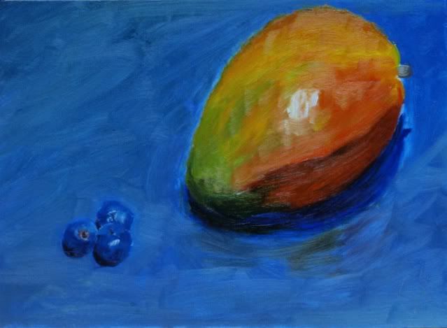
Mango and Blueberrys
Having fun with both fruit and Edgar Payne balance composition. I went for the blue cloth to compliment the orange in the Mango while creating a tough platform for blueberries. Light was directly from the top.
Sunday, January 23, 2011
Color Studies
I have decided that shadows are a nemisis. Specifically what a color does as it is in shadow or shade. My friend Dave Connolly recommended some color block studies. He mentioned he knocked out about 12 during a painting class. I made some blocks and set up a couple of different settings to see what the effect were.
The shading was added by adding cobalt blue, to the direct light color (Top color) to the medium side and then more cobalt for the shade side. Where necessary, I added prussion blue to intensify the dark. I should have color balanced because the table cloth is white. The shadows were created by adding the complimentary color to the block in shade.
1st painting Backlit. Strong Colors with backer wall. The red block is floating a bit. I tried to correct on 2nd picture by darkening the lowest area of the shaded side.


The shading was added by adding cobalt blue, to the direct light color (Top color) to the medium side and then more cobalt for the shade side. Where necessary, I added prussion blue to intensify the dark. I should have color balanced because the table cloth is white. The shadows were created by adding the complimentary color to the block in shade.
1st painting Backlit. Strong Colors with backer wall. The red block is floating a bit. I tried to correct on 2nd picture by darkening the lowest area of the shaded side.

2nd Photo. Backlit, lighter colors. Two big changes here was the addition of reflected color and varying the side colors to allow the block to appear more natural.

Tuesday, January 18, 2011
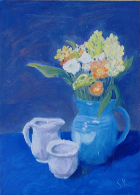
Blue Vase
Never set up for a Still Life. Til now. I pulled a bed sheet out and set up some lighting. I could still use some drawing practice, but I am happy with the colors. I cant make the photo look like the painting, so it does not appear exact.

Saturday, January 15, 2011
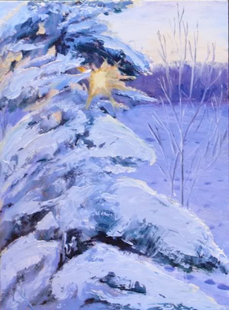
Backlit Pine
This was how I spent my lazy day today. Bushwork underneath with some heavy pallet knife work to complete.
Very much fun.

Very much fun.
Subscribe to:
Posts (Atom)